SAFYRA
BRAND IDENTITY | REBRANDING
01
Subtle Luxury
Safyra is a premium hand and foot care space where professionalism, aesthetics, and conscious self-care come together. The brand is designed for people who value not only flawless results, but the entire experience – calmness, comfort, and the highest standards of quality. Here, luxury is not expressed through excessive shine, but through harmony, precision, and attention to every detail.
02
Harmonious Typography
The logotype typography reflects Safyra’s core idea – a balance between strength and subtlety. Elegant transitions between two stroke weights create a sense of lightness and refinement, while the symmetrical composition of straight and rounded forms gives the identity harmony and visual calmness. It is a logotype that feels confident in its value, yet remains aesthetically restrained.
03
Sapphire Symbolism
One of the key identity elements is a subtly integrated sapphire-shaped rhombus. It symbolizes value, longevity, and impeccable quality – qualities that remain relevant over time. An additional layer of meaning is created by the detail in the letter “a,” resembling a plant sprout and a sense of growth. Together, these elements communicate naturalness, inner strength, and a philosophy of care, transforming Safyra from a beauty service into a refined self-care ritual.

TESTIMONIAL
Now I can honestly share how I feel. At first, when I saw the logo, I had this strange feeling – as if it had simply always been meant to look this way. There wasn’t one big “wow” moment, because everything felt so natural.
But the true result revealed itself when we started bringing all the elements of the new identity together, replacing the old logo and seeing the bigger picture. That was when I realised just how significant the transformation really was.
Today, when I look at Safyra, I see a mature brand that knows its worth – a brand whose visual identity finally reflects who we have already become and the values we stand for.
Simona, I’m so happy I chose you. And a special thank you for your patience – I’m sure working with me wasn’t always easy. 😅 But now I can say with complete confidence that it was absolutely worth it.
I’m incredibly happy with how everything looks today. And perhaps the greatest compliment is that I simply can’t imagine Safyra looking any other way. 🤎
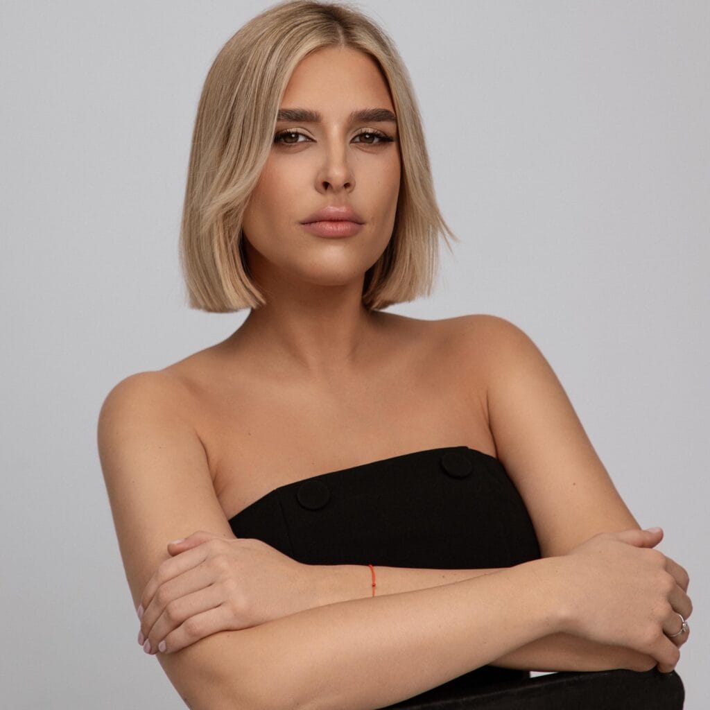
Brigita Bačkytė
MB Safyra Studio
BEHIND EVERY
BUSINESS THERE
ARE PEOPLE

I invite you to dive into the creative journey together