WIND TURBINE SERVICE
BRAND IDENTITY | UNIQUE WEBSITE DESIGN
01
A Unified System
A cohesive visual identity system was created for the Wind Turbine Service business, from the logo to a unique website design.
The entire visual language was carefully considered — including colors, typography, shapes, graphic elements and their interaction — creating a consistent visual style and clear guidelines for its application.
The result is a cohesive, modern and easily recognizable brand identity.
02
The Logo Concept
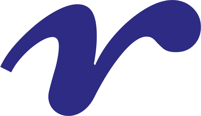
At the heart of the logo symbol is a stylized bird, whose form intentionally balances elements of nature and technology.
The outstretched wings are reminiscent of a drone structure and wind turbine blades, visually connecting the company’s service activities with technological precision and the renewable energy sector.
The dynamic shape of the symbol conveys movement, energy and professionalism.
03
Color Palette
The color palette was designed to communicate the brand’s modern, technological and energetic character.
Dark blue adds a sense of reliability and professionalism, while purple represents innovation. Bright cyan and green tones introduce a fresh technological feel and subtly connect the brand with renewable energy and sustainability.
The contrasting color combination keeps the identity bold, distinctive and easily recognizable.

KVIEčIU ir TAVE kartu pasinerti Į KūRIMO KELIONĘ