
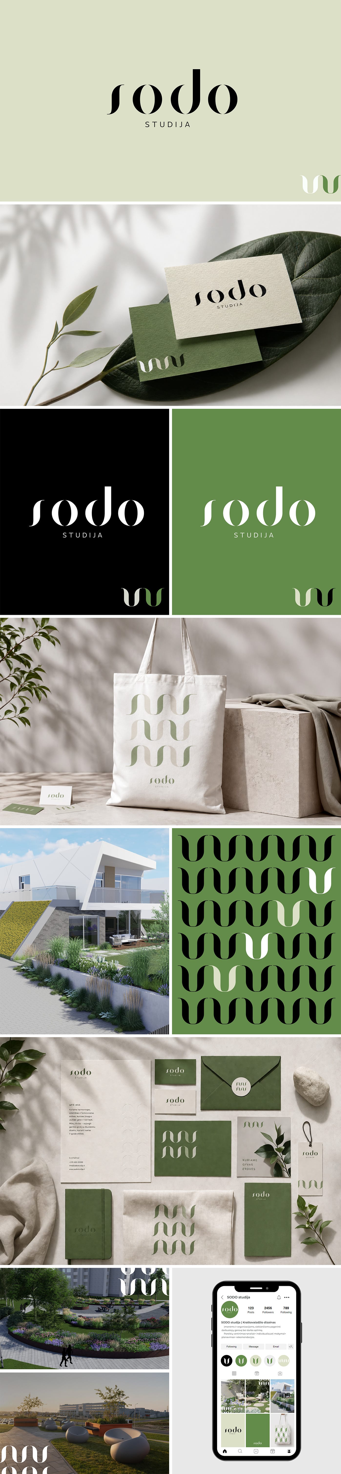
SODO STUDIJA
BRANDS
01
About the brand
A modern, minimalist brand focused on landscape design, installation, and maintenance. Its essence is to create harmonious, aesthetic, and functional spaces where people feel good and truly belong. The identity bridges a deep connection to nature with contemporary design thinking, emphasizing individuality, sustainability, and emotional peace. It is more than just a service—it is an experience and a thoughtful relationship between people, space, and nature.
02
Shape symbolism
The most important elements of the brand identity are the flower and the circle. The flower in the letter “S” symbolizes life, growth, and natural beauty, inviting a connection with the surroundings. Meanwhile, the “ODO” part, encased in a circle, conveys wholeness, completion, and a continuous cycle—the rhythm of nature where everything moves, changes, and renews. The harmony of these shapes creates a balance between aesthetics and functionality, between human creativity and natural processes, reflecting the brand’s aim to create living, breathing spaces.
03
Color characteristics
The color palette is based on the principles of naturalness and harmony. White conveys cleanliness, minimalism, and a sense of space; black provides stability, elegance, and structure. Moss green symbolizes life, growth, and the connection to the earth, while sand tones add warmth, comfort, and organicity. Together, these colors create a balanced, aesthetically cohesive visual language that subtly reflects a nature-inspired yet modern interpretation of the brand’s character.
TESTIMONIAL
Simona Morozova and I have known each other since 2021. That was the year I had just started my business, and I clearly remember reaching out after seeing her work on social media and asking about the possibility of collaborating. At the time, she sincerely advised me not to rush and to come back once my business had grown stronger.
In 2024, the time finally came for SODO STUDIJA to gain a new visual identity.
I truly value clear and effortless communication, which is why the entire creative process felt natural and smooth from beginning to end. The final result perfectly reflects our company’s aesthetic, values, and character.
I believe that Simona Morozova and I will share many more beautiful stages of collaboration in the future. Thank you!
Evelina Jucytė
MB Sodo studija
BEHIND EVERY
BUSINESS THERE
ARE PEOPLE

I invite you to dive into the creative journey together